Preface
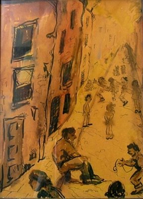
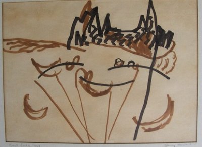
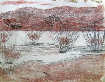
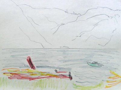
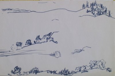
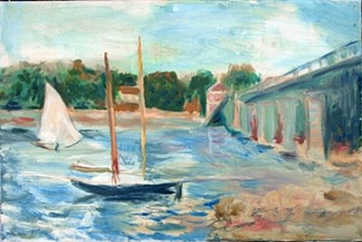
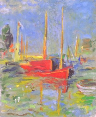
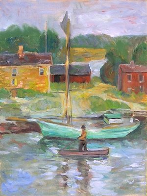
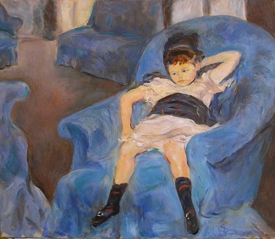
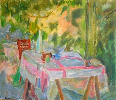
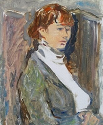
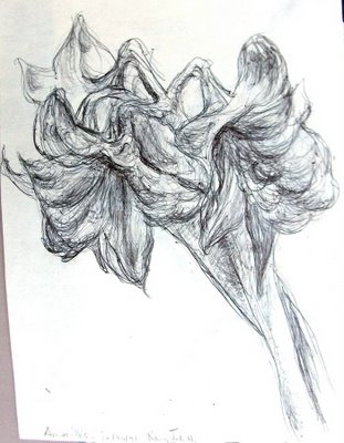
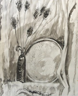
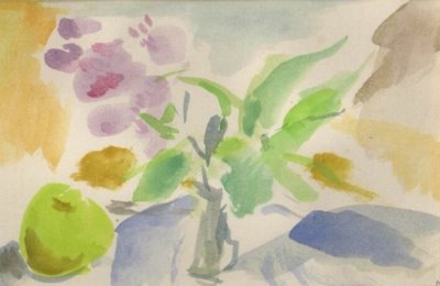
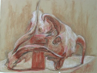
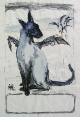
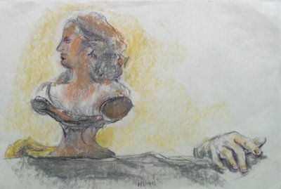
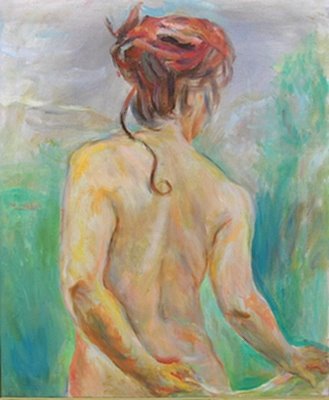
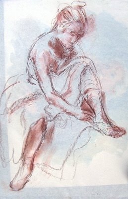
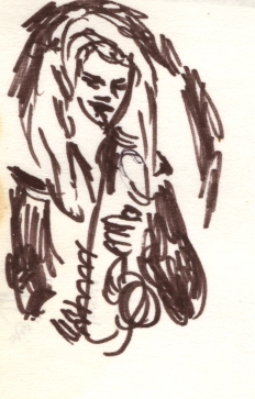
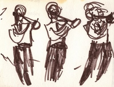
This blog and a companion one (http://momtheartistparttwo.blogspot.com) make up a retrospective review of the artwork of my mother, Nancy Millicent deBeers Howard, from 1928 at age 9 to her death in 2006 at age 87. The current blog has this Preface and chapters 1-9; Part Two has chapters 10-19. (If for some reason typing in the web address doesn't bring it up, you can also access it by clicking on "My Complete Profile," in the right-hand margin of this text.) The chapters are of uneven size but have an average of about 14 images per chapter. This is less than a quarter of the total works in her possession at her death. Besides the artwork, this blog includes a text commentary by me, her eldest child, giving some background for the pieces.
This project started as a slide show done after Mom’s memorial service, to 20 or 30 people who pulled themselves away from the reception activity. I'm doing these two blogs to make her work accessible to more people, including people who may never have known her. The content follows the slide show, except that I have expanded my comments and added images that have come to my attention since (notably ones provided by brothers John and David, and sister-in-law Ronda). I have also incorporated all 12 images from a 2005 picture calendar using her work that was on display at the memorial. There are actually 20% more images here than at the memorial service. So even people who were at the slide show have reason to look at these blogs!
Since blogs are works in progress, please check the end of this preface each time you enter the site, for a description of what has been done when. I would appreciate any feedback. My wife Ela is the one whose idea it was that I should put Mom's work out as a blog, as opposed to mailing out CD's, and she showed me step-by-explicit-step how to do whatever it is that I've done.
The artworks themselves are the property of her estate, in her children’s possession, and none of them are for sale. Except for family, no reproductions of the work should be made from this blog without written permission from this blogger, Michael S. Howard, mh503@msn.com. I am planning a 2007 calendar with 12 of these works on it.
The images (as opposed to the artworks) are far from professional quality. I did them quickly, using either a scanner (which a few times cut out what did not fit on the glass plate) or a low-end camera in whatever natural light was available. I did most of the images while Mom was still alive, in hopes of getting her comments. She tended, however, to comment only on her current work. I am grateful for that.
On your computer, you may find some of the images uncomfortably small. The ones that are wider than they are high have been reduced by the blogger program to fit into the the text margins. For these, if you click on the image it will display in larger format. Then you use your browser (clicking on the green arrow at the top left of your screen) to go back to the text. You just wait a bit and it will put you back to where you left off.
I find that it takes about 15 seconds for the whole blog to reload after I've looked at an individual image. That's a bit long. However there is a trick you can use. Read the blog chapter by chapter, selecting the one you want by clicking on its title to the right of this preface. Then the computer will only have to reload that chapter after each picture you see in larger view, which is much faster than reloading the whole blog, less than a second, I find. At the end of the chapter, you can click on "home," and the computer will reload the whole thing for your next selection. Or you can go to the top of the page and click on the title of the next chapter, in the right margin, which loads faster. (Actually, it was to take advantage of this trick that I made two blogs instead of one. The blogging program gives you a maximum of 10 chapter headings per blog on its automatic setting. It will do more if you "customize," but that sounded too complicated for me.)
Even clicking on the image, you may find it too small. The painted images look best when they take up most of the available screen vertically; for images in ink, about two thirds of that. To enlarge the images, you'd have to reset temporarily the display settings on your computer. In Windows, you do that by clicking on "start" at the bottom left of your screen, then moving to "settings" and clicking on "control panel," then clicking on "display" and finally "settings" at the top of the page. There is a little bar near the middle you can move with the cursor. Set it to "800 x 600 pixels."
For reference purposes, I have given each image a number and a letter. The number originally corresponded to the chapter the image was in, but then I had to combine a few chapters for the blogs. The number and letter combinations still do their job, so I didn't bother to renumber them all.
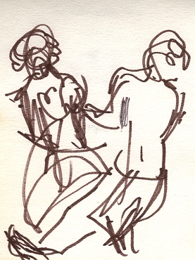
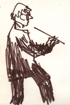
The actual size of the artwork, as opposed to the images, varies a lot. Her ink sketches outdoors, including the ones to which she added small amounts of color, were almost always 5.5 by 8.5 inches. Her color sketches outdoors (not oils) were mostly 8.5 by 11 inches. Her oils vary in size, from 16 by 20 inches to 24 by 32 and even larger. The most popular size was 18 by 24. I will try to indicate when a canvas varies from that by more than 6 inches either way. Her studio sketches on paper are the same size as her oils or a little smaller: 18 by 24, give or take 6 inches.
The first blog is Mom's work up to 2004, when her health started declining. It is mostly work she did in her 70's, all of it magical and full of life. The second blog is devoted to work in her last year and a half, from 2004 to 2006, ages 85 to 87. Before 2004, her art was a part of her life that she shared on occasion, but did not try to impose on others. So I remained fairly ignorant of the process behind it. In 2004, she became more dependent on her children, and she was showing us her work as she did it. In consequence, I know a lot more about her last work. More than that, I think her last two years are the most interesting. Few artists have been able to express their farewell to life in art at so advanced an age, with so much artistic development already behind them, and with such focused intensity.
Read the chapters in order, because you need to see how well she mastered the conventions and techniques of her craft before going out totally on her own. Her last work can best be appreciated in the context of what came before. But be aware that the real breakthroughs in her work came after her strokes, at a time when her verbal communication and processing were confused and her daily activities radically impaired. It was a time when health professionals often applied the word “dementia” to her—-although not, let me make it clear, dementia of the Alzheimer’s variety. Fortunately, she could still do her art. In fact, it was under such conditions that she had both the necessity and the opportunity to focus her remaining creative powers on this work. The result is not just a memorial to her life. It is, not only in my opinion but also that of an art history professor who happened to be at the slide show, a unique and priceless contribution to the world of art.
PROGRESS REPORT: 10/12/06, chapter headings and the first few lines of each.
10/27/06: full preface, chapter 1, chapter 7.
10/28/07: chapter 2.
10/29/06 chapters 3-6.
10/30/06 chapter 7-9. Created 2nd blog. Chapters 18-19.
10/31/06. Revised texts, renumbered chapters, added chapters 10-17.
11/1/06, 11/2/06, 11/3/06. Revised prefaces. Minor editing. Resized some pictures.
11/7/06. Added ballroom dance sketches and one landscape sketch.

